Bought this little number on X-mas while the fiancee and I were over at his parents' place for the holidays. After showing his sister (her daughter will be the flower girl) the dresses that I thought were nice looking that I found on-line we came across this on e-Bay:
This was just under $25 WITH S&H, so we quickly decided between the two of us that this was the flower girl dress. Hopefully the low price doesn't reflect the quality.
Other than that, flower girl dress = check.
Thursday, December 31, 2009
Sunday, December 20, 2009
Folding the Pockets
YAY! Now that finals week is over for me I can start making progress on the invites. I plan on making them in stages so I'm sorry to anyone who would just like a basic run-down of how to make these. My inspiration and instructions comes from Heather Drive's site, http://roadtotheaisle.blogspot.com/ , where I originally fell in love with pocketfolds. Moving right to the point here's what I used and what I learned from this process.
Supplies:
- Paper cut to 7" wide by 16-1/8" pieces; I used Astrobrights Glisten, Lunar Blue
- a butter knife or boning folder
- measuring device - I used the Fiskars Deluxe portable trimmer and just yoinked out the blade to use the gutter for scoring
**Side note: this trimmer in itself is HORRIBLE and will either shred your paper (especially if you only need to TRIM) or leave the edge somewhat unclean. Make sure to try out your cutter before you start on the actual paper so you don't ruin your paper and you know its capabilities. I highly recommend getting a rotary trimmer, they seem to create the cleanest cuts even though they're harder to cut a line with a precise starting and stopping point.
Here we go:
First off, test score the paper you have because some paper wimps out and looks disfigured if you score it too hard.
Using the butter knife/boning folder measure 3" from the top and score
*if using a butter knife make sure you're not using the serrated side or you'll end up sawing and ruining your paper
rotate 180 degrees
Measure 3" from the top and score
Measure 5" from the 3" score (8" total from the bottom) and score
**If one of your 3" scores doesn't look all that great then use that as the bottom because this will be hidden once folded over.
Fold the paper towards the score
This is what it looks like when you score and fold it towards the score:
This is what it looks like if you score and fold it away from the score:
It's really hard to tell from these pics but when you fold towards the score the outside looks good but the inside tends to have a double line look. When you fold away from the score the inside looks great but the outside looks like you've damaged the paper and it seems like the paper is going to break. I would recommend folding towards the score.
So back on topic, fold the top towards the score and crease
Fold the bottom towards the score and crease
Fold at the mark 5" up from the bottom score towards the score and crease that too
Tada!
Place finished products under books to weigh it down if you'd like.
Next up: Step Two, Cutting These Suckers
Sunday, December 13, 2009
The Paper is HERE
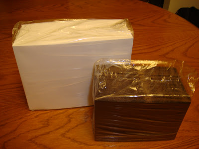
The paper I ordered from Anchor Paper:
The Envelopes from Envelope Mall:
All of the items with the paper scraps:
Alright, now I can get some work done. This all arrived on Friday but it's been sitting on my table all weekend because this upcoming week is finals week and the job that I had been waiting forever to open has just started accepting applications. I've been editing and re-editing my resume and cover letter all weekend but I haven't forgotten about all the paper. I definitely will be getting to this on Thursday but I'm anxious to start as soon as I can.
Monday, December 7, 2009
Ordering the Paper
I ordered all the paper I would need for my invitation project and some for the other random paper projects I have and now I'm just waiting anxiously for it to all arrive so I can begin. Here's a breakdown on what I got:
Envelopes
ordered from envelopemall.com
$13.75 - A-7 Mohawk Super Fine 100 pack, white
$11.95 - A-1/4 Bar Stardream Metallic 100 pack, bronze
$12.12 - S&H, cheapest option
Total = $37.82
Paper
ordered from anchorpaper.com
Tom Peterson is awesome!
$27.64 - Astrobright Glisten Lunar Blue, 7" x 16-1/8", 86# cover, appx 70+ sheets
$20.25 - Nekoosa Linen Carrara White, 8.5" x 11", 80# cover, 250 sheets
$25.50 - Stardreams Bronze, 12" x 12", 105# cover, 50 sheets
$16.14 - S&H
Total = $86.18
So that's just the paper and doesn't include glue, ink, embossing powder, stamps, ribbon and such which I'll get around to analyzing later. I'm not sure what type of sticky item I'll be using to "fuse" these puppies together. I've heard great things about terrifically tacky tape, but since I've never used it I might just go and use tacky glue and a paint brush instead. Other than that, all there's left to do is proof and reproof the wording and layout until the paper gets here... then the real fun and chaos begins
Tuesday, December 1, 2009
Viva Las Vegas!
A while back the fiancee and I had decided that we wanted the ceremony and reception held in Vegas. I had never been to Vegas, but the fiancee had wooed me with tales of the beauty, excitement and what have you of the place and I agreed that we should at least check it out. Our main reasoning for determining that this was the place to hold our wedding was because the majority of our family members (mainly mine) were scattered all over the place, so having the wedding in a place that has the cheapest airfare to travel to from almost anywhere was high on our list. We also wanted to include videostreaming for those who wanted to join but couldn't afford to travel and found that the majority of the venues there offered streaming. So with that being said, we began the research waaaaay back in... May? August? sometime around there.
We started off by looking at a map and writing down names of the hotels/casinos. Then we went on the internet and started crossing off places that were too expensive, far away or just really crappy looking. After all that we still had a list of about 10 or so places that we had an interest in but weren't too sure about. With this list, I had the fiancee e-mail the places before we headed off to check it out during Thanksgiving week just in case they required us to set up a meeting time; almost everyone said to just call the day before.
The first day we took it easy after a 20+hr drive down from Washington and just walked around aimlessly to get a feel for the place. At first glance all that looks so close, but it's very deceiving; the Eiffel tower is about a 20 min walk away in this picture. Thank goodness for the escalators up to the overpasses or else we would have been extremely exhausted just walking from Excalibur to the Bellagio and back.
Eventually, we got down to business and started looking over the places once more and making more drastic cuts based on what we knew we could spend and what we wanted to get out of the places. This was the hardest part because I just wanted to check out all of them since I had never been to Vegas. Finally, after many hours of going back and forth with the fiancee, we called the Monte Carlo and set up an appointment to meet with their catering coordinator, Traci Shea, mostly because she was the only one who took the time to write us a personalized e-mail.
I was very nervous since this was our first place we checked out and didn't feel like I had all my ducks in a row. Luckily for us, the staff at the Monte Carlo Wedding Chapel have done this song and dance dozens upon dozens of times and had the whole thing down to a science. We walked around, checking out the ceremony site and the reception areas right around the corner asking many questions and posing many hypothetical situations along the way. Both the chapel personnel and Traci were very patient with us and seemed willing to entertain some of our "crazier" ideas as well as joke around with us.
Afterwords we decided to take some time to mull the whole thing over and decide on if this was the right place for us as well as the package and amenities we would want if we decided on this place. I was a little hesitant because this was the first and only place we had seen and felt like we were settling and hadn't explored our options thoroughly enough. My fiancee on the other hand had decided after seeing some of the reception rooms that this was the place and had passionately tried to convince me until I thought so as well. He wanted to go back as soon as he had won me over, but I wanted to take my time looking around and leave it until the next day so we could iron out all the details when the staff wasn't trying to leave for the day.
The next morning/afternoon we practically ran over there to sign all the paperwork and get everything started. Heather, the chapel coordinator, was extremely helpful and patient while we filled out every form and read every line of all the papers she put in front of us. Traci was also very helpful but unfortunately wasn't able to provide us with a cake testing session since the Monte Carlo exclusively provides all the larger food and drink items (smaller, individually wrapped items for gift boxes are alright) but told us that the buffet carries the same type of cake that would be available for our wedding cake and went down there later to try some with lunch.
With the last of our 't's crossed and 'i's dotted for the ceremony and reception site we felt as if a huge weight had been lifted. We took those good feelings and energy and decided to walk the rest of the interesting part of the strip until our feet were numb from walking. We called our parents soon after getting back to the hotel and had the best night's sleep since we had been down there.
Since we still had the rest of Thanksgiving break down in Vegas we decided to go to the Rio for the Thanksgiving buffet, go to downtown to get our marriage certificate and gamble a little. We found our preferred games in our hotel and after a while I had gambled away all I had planned to lose but since the fiancee was still working on making his pile of money disappear at a Pai Gow table I decided to go up to the room and work on the small bottle of rum that we purchased from a nearby liquor store. When he was done and came up to the room I was in a nicely buzzed state and wanted to go out and do something. Eventually we made our way to a bar nearby the Mandalay Bay casino area called Minus 5 that the both of heard about through a coworker and some other staff at the nearby hotels and casinos. Yes, it was cold in there but everything (except for the floor) was covered in thick ice. They even serve your drinks in glasses made of ice! The night was made even nicer by the bartendresses and camera gal who seemed happy to have us there being socially drunk. Overall the night was nice, the company was nice and the drinks were cold as ice; definitely a place to go back to.
With all that, we made it home safely on Saturday after surviving and leaving on black Friday and driving 19+hrs straight through to home to collapse on the sumo. Well, that's not entirely true, we did loose the muffler in Salt Lake and Hell's Canyon was a bit tricky with all the frost on the road and the snow on the side but thank goodness for studless snow tires. Next time this will be a bit easier because it will be summer time and we'll be able to take the drive at a more leisurely pace.
Friday, October 30, 2009
Bridesmaid Cards, Part Three
So to recap, I've been slowly but surely working on cards for my bridesmaids (see: will you be my bridesmaid cards and bridesmaids cards part 2) and it hasn't really come together until just recently.
TADA!! Two of them will be hand delivered because they live within a day's drive but the other one will have to be sent via USPS. Even though it's being sent in a padded envelope I'm hoping that USPS handles it with more care than they do my mail because on more than one occasion I've gotten bent mail.
I know that at least one of them will be saying yes but the other two are giving me a little trouble because I expect them to wear a dress for the day. While I could understand if I picked out something poufy, neon or expensive I'm letting them decide on the style and between the three of them pick either white, blue or brown as the color. So what I've decided to do is sit down with them and figure why and give them a deadline to say yes to wearing a dress or I'm not having them as bridesmaids and ask my four sisters to be bridesmaids instead. Sure that seems a little cold but I feel like I'm being more than fair and I hope that it doesn't all somehow blow up in my face.
Furthermore, if I do end up asking my sisters to be bridesmaids I would also want my fiancee's sister and only sibling to feel involved as well. Sure I'm having her daughter be the flower girl and I think she will be 3 by the time we get married but I worry that she'll have performance anxiety. So if it looks like either of these are the case I plan on asking his sister to walk down the aisle with her.
Other than that I'm still planning away, we'll see where everything goes from here.
Thursday, October 29, 2009
Photoshop and Mockups
Recently I purchased a bunch of paper that came close to the colors I wanted to do a trial run and get a feel for how these puppies are supposed to work (I'll post the photos as soon as I remember to take pictures). There were a few snaffoos that I came across through trying to use a ruler that doesn't have a good start line and using a cutting tool that doesn't like to cut thick material but overall I liked the design. The few problems I had were that the size of the font for the announcements, accomodations and RSVPs felt a little too large and the pocket fold looked a little too vacant in the pocket area. Without wanting to waste more paper I put together a design in photoshop to see if the design could be tweaked without going mad. So far I've decided to add in a map of the Las Vegas strip, decrease the width of the RSVP and came up with this:
I think this is done in Agency FB 11pt for the names, but I forgot to save some of the text layers unmerged.
Edwardian Script ITC size 30pt for "Las Vegas Map"
Dimensions: 6.5 x 4.75
border on announcement: 6.75 x 4.875
Pocket Fold:
Dimensions:
13-1/8 x 7 right now
16-1/8 x 7 when it's all unfolded
creases at:
3" from top
3" from bottom
8" from bottom
Adding the map does make this feel more complete but I'm not too sure if I like the map design just yet. While I want to get as much information on the map as possible it feels a little too crowded. Another problem is that when you search for a map of the strip, no two maps are alike which in turn has made me go a little batty. Originally this map was in red but after some long hours of photoshop tweaking I eventually changed it to blue. Again, I'm not thrilled with how crowded this looks or how tiny the lables turned out but this is just a first draft. Maybe make it fold in half so I can stretch the image and make the font bigger? Thoughts?
Sunday, October 25, 2009
THE Earrings
Again I've been searching a lot for what I want and found that I've been leaning towards chandelier earrings but a lot of the ones I like are usually expensive. I managed to find these earrings at a local craft fair and since they were less than $25 I decided to go for it. So even though I have yet to try them on with the dress or the hair style I have yet to pick out, if they don't work out at least they'll look great with an evening gown.
Tuesday, September 15, 2009
Blue Flowers in the Bouquet?
I've been looking around but the only way to incorporate blue flowers into your bouquet is to either use blue hydrangeas or blue grape hyacinths. Yes, irises have also been used for blues but I find them kind of on the purple-ish side. There are four options that I've come up with:
1) Incorporate blue feathers into the bouquet.
I searched the web for cheap feathers for this and became informed on ostrich plumes, drabs and all sorts of things in between that made my head spin because of all the information and the pricing on some of them for just one freaking feather.
http://www.allcostumes.com has them on sale for $0.63 per each 6-10" mini plume
http://www.wholesaleflowersandsupplies.com for $2.70 for five 9-11" drabs ($0.54 each)
http://www.ecrater.com for $2.30 for a 1/4 oz of 2-6" fluff
http://www.michaels.com has picks for sale but I'm not sure how much they are
Also, there's no Hobby Lobby or other alternative craft store within a day's drive so if I want feathers it's either going to be acquired on-line or at Michaels.
2) Figure out how to dye some flowers blue.
I know this can be done because I've seen blue roses out there on the market. Either they were genetically engineered to grow with the blue color or they were put in water with blue food coloring after they were cut so they'd "suck" up the blue dye and turn blue just like a carnation would. I haven't tested dying them blue yet but as soon as I get some fridge space or the apartment is cold enough (heck I've even though about doing this at work because it's so cold in there) then I'll be doing some testing. What I'll also need to look out for is how long the roses last in certain conditions and how much blue I'll need to either get a full on blue or just a tinge.
3) Dye/paint something blue.
This might be done if I decide to go with silk flowers because I think it would completely destroy a real flower if I dye/paint it blue... although it might be worth it to try and dye a real flower just for fun.
4) Deal without.
I've been searching and there haven't been a lot of brides that have blue flowers in their bouquet but also I figure I should have a plan B just in case none of this works. The backup plan is to try and find an all white bouquet but I'm not liking a lot of what I see. Maybe I'm not much of a bouquet person but to me a lot of bouquets look chaotic and thrown together without a lot of thought.
Thursday, September 3, 2009
Make Your Own Stamp
For a while I've been hunting the internet for the perfect stamp for me to use that is either the same or very similar to the design I have on the invites. Unfortunately there has been no such luck but I did come across http://www.theartfulcrafter.com/stamps.html where I got the idea to just make my own damn stamp. I've been sitting on this process for a while and testing it out but here's what I've come up with.
Materials you will need:
*cheap erasers (look for the multi-packs from Walmart for the back to school sales)
*x-acto knife
*toothpick, dental tools, or some small picking/prodding object
*fine grit sand paper
*printout/hand drawing of your design (works best with less detailed and thicker designs)
*pencil
*LOTS of patience
Step 1:
take printout/drawing of your design (make sure this is not your master copy) and trace over it in pencil so the design has a lot of pencil lead.
Step 2:
flip the design over and put it on the eraser, then rub on the back of the paper so the pencil lead transfers your design on to the eraser. If your design is bigger than the eraser then you might need to glue some of the erasers together. I recommend using super glue to stick them together but try not to get the glue on the surface of the eraser or you might have problems later getting the ink on to the eraser for stamping. After transferring the pencil lead on to the eraser, darken the lines with your pencil or a pen so you can see your design better.
Step 3:
with all the cutting skills and patience you have slowly and carefully cut out your design; this is why the bigger, simpler design works best. If your design is complicated like mine, be prepared to make small cuts and start over when or if you cut it wrong. While cutting, try to keep a little more of the eraser than you need because you can always cut away the eraser parts but you can't add it back on (well you can but it's a very messy process and you might as well just start over). Also remember to try not to cut underneath the design for the outline or else you might end up accidentally cutting off your design like I did at one point. Use the toothpick/dental tools to help you clear out the cut pieces from the smaller areas. The web site recommends cutting the inside of the design out first, but I found either way works.
Step 4:
test out your stamp, correct where needed and cut away the background parts for a cleaner image. Use the fine grit sandpaper to smooth the edges BUT if you have one of the crappier erasers they might just fall apart from sanding, so TEST it out on the eraser before you try it on the design.
Step 5:
TA DA! Enjoy
Monday, July 27, 2009
Thank You Parasol
I was roaming around the knot again when I saw this from Pink Petals Event Design's web page:
I thought this would be a great for creating my own thank you cards; just take a photo on our wedding day with my then hubby and me kissing and holding this in the shot. Sounds simple enough but this is just an idea I had that I'm not sure if I'll do or not.
Invitations
This project is still in the works but with help from my fiancee I've been able to at least get a design down. I plan on doing pocketfolds and my inspiration comes mostly from roadtotheaisle.blogspot.com; I really appreciate the instructions she has posted. For my design I originally started off playing around in publisher, but made them so much better by throwing them into photoshop that I eventually acquired. If you like the fonts on some of these, they can be found at 1001freefonts.com or dafont.com
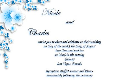
Announcement, font: Exmouth size 36pt for names, 28pt for the "and"; Monotype Corsiva 14pt for the rest of the text.
Dimensions: 6.5 x 4.5
We decided on having the ceremony in Las Vegas because it would be the cheapest place for everyone to fly and because it looks like a place that has at least something for everyone.
Accommodations, font: Edwardian Script ITC size 30pt for "Accommodations"; Monotype Corsiva 14pt for the rest of the text.
Dimensions: 6.5 x 4.25
All of this is tentative since my fiancee and I still need to check out venues, figure out who we want to go through and set the date. I saw that you can get discounts for some airlines from another friend that got recently married but I'm unsure how to get this. Definitely will get hotel discounts but we'll figure this out later.
RSVP, font: Edwardian Script ITC size 30pt for "RSVP"; Monotype Corsiva 14pt for the rest of the text.
Dimensions: 5.125 x 3.625
I'm trying not to have too many children attending the wedding so I will either write out or print everyone's names to discourage that. This is not to say that I don't like children, I just don't want to have to deal with them on this day if I can help it. Also, we plan on having the event streamed so those who can't make it because of time conflict, financial strain or whatever can still watch; just not sure how to word this until we figure out how guests access the stream.
Escort Cards, font: Monotype Corsiva 48pt for the names, 30pt for "Table" and the numbers.
Dimensions: 5 x 3
I have an idea although I'm not sure how I'm going to do this but instead of having a guest book to sign I want the escort cards to double as something to write on and submit to the card box so people don't have to find the guest book, wait to sign it or have other people read what they write if they don't want to. For now this will just be as it is but eventually I'll play around with some paper, layouts and whatnot to see if I can get this idea to work.

Table numbers, font: Porcelain size 60.99pt for "Table"; Monotype Corsiva 257.68pt for the number. The sizes are a bit odd because I altered the text box after I typed in the text.
Dimensions:
4 x 4
or
4.5 x 4.5
eventual background:
4.5 x 4.5
or
5 x 5
Just plain old numbers for me. My fiancee wanted to do themed tables, but I figure it's easier for everyone to find their tables if they're numbered and have some order to them. Maybe I can incorporate both somehow but for now they stay as numbers. I'm still playing around with these; I could just go out and buy some 4 x 6 frames and design the table numbers to fit them. Again, still playing around
All the paper for this seemingly daunting task hasn't been ordered but I have gotten swatches from anchopaper.com and the fiancee and I have decided that we like: Lunar Blue cover weight by Astrobrights Glisten, Bronze cover weight by Stardream Metallics, and 96 Carrara White cover by Nekoosa Linen. We haven't figured out how much and what sizes of each color we're going to get but there's still plenty of time to think about that. Also, to start off we originally wanted to do wax seals to close the pocket folds up but after reading around the knot boards I've been finding that it's going to cost extra in postage to incorporate the seals. Instead I'm trying to figure out some sort of image to either stamp or print on a square piece of paper to hold it shut instead of a monogram. I've been scouring the web for some cherry blossom flower stamps that come close to my design or try to figure out how to either order my own stamp or create my own from scratch. As of now there hasn't been much progress but something will be figured out eventually.
Friday, July 24, 2009
Bridesmaids Cards Part 2
After taking some time away from making these I made some headway in making them look a little more crafty. I usually find it's easier for me to walk away from a project for a bit when I'm stuck to make progress than to sit and be frustrated at myself for having no idea on where I'm going with this. While I'm not sure if they feel finished or not it at least looks better than what I started with. The problem I'm having is that even though the flowers add to the crafty tone, I feel as if they might need a little embellishment.
As far as the front of the cards I decided to buy one of each of the necklaces except for the blue opal flower necklace. It dawned on me that I didn't have to make my bridesmaids match and since I was having a hard time picking one and everyone I was talking to gave me a different opinion, I figured why not. One of the pendants doesn't have a chain, but that can be fixed fairly easily once I get it so I can figure out which style would work with it.
Tuesday, July 21, 2009
Will You Be My Bridesmaid Cards
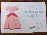
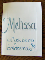
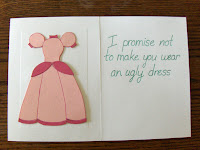
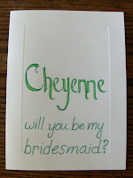
After wandering around the knot boards I decided to make formal cards for my prospective bridesmaids after seeing several brides that were making them for their own. The deal was sealed after I came across the phrase: "Will you be my bridesmaid? I promise not to make you wear an ugly dress" on several of them that made me laugh at the thought of picking out something truly ridiculous for my friends to wear. It started off simple by buying some cards from Michaels for $6.
I sat on these (no, not literally) for a month or two, all the while doodling, sketching and trying to come up with a layout. I finally threw the sucker into Publisher to get a layout or at least some idea of how I wanted this to line up. A while more had passed and still nothing... that is until I found some pens and paper on sale at Jo Anne Fabrics and was momentarily inspired to start doing something.
Outside:
Inside:
The names took me a long time and making three pink dresses in the style of Princess Peach (there's a story for that one) for each took me a while as well but all is not finished. I added on the text later but found that I had forgotten to plan for spacing when I originally started. Not wanting to start over, I decided to set the project aside for a bit to think about something that can be done to fix this.
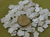
After some more random doodling I decided I should add a bouquet of flowers to the inside under the text. At first I figured I would just draw out the bouquet, but after wandering through Paper Pals I became embarrassed of my creations thus far and decided that it needed more pop, pizazz or whatever to jazz it up and make it look more crafty. It took a while but I managed to find a paper punch for under $7.50 with tax on clearance at Michaels that had the exact design I wanted which I was glad to find since I was contemplating individually cutting out the suckers myself. It was a little tedious to punch enough to make a bouquet but I'm not completely sure if I'll leave the flowers white or spray/color a design on each of them or put a background behind it all. Something will be done but I'm still tinkering around with this.
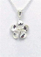
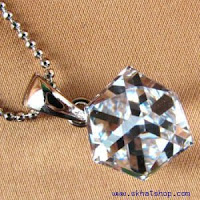
As for the space above their names I'm contemplating putting a necklace there. I've looked around and found several pendants that I like, but it's deciding on what they like and what would look good on them that is the tricky part. It's down to four finalists:
Option #1
from:
http://cgi.ebay.com/13.5MM-STERLING-SILVER-SHINY-PLUMERIA-FLOWER-PENDANT_W0QQitem Z120439686855 QQcmdZViewItem
for $3.99 each with $3.95 s&h
this for the pendant only so I'll have to find a chain for it
it also goes off the market, or the seller has listed an end sell time for July 24th at 10:50am
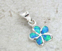
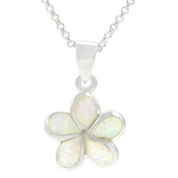
Option #2
from:
http://cgi.ebay.com/ELEGANT-STERLING-SILVER-OPAL-PLUMERIA-FLOWER-PENDANT_W0QQitemZ 370202489893 QQcmdZViewItem
for $10.99 each with $1.95 s&h
also without a chain
Option #3
from:
http://www.ecrater.com/product.php?pid=1124568
for $18.95 each with $2.95 s&h
this one does have a chain, so that is a bonus
Option #4
from:
http://www.overstock.com/Jewelry-Watches/Sterling-Silver-Created-White-Opal-Plumeria-Necklace/4118221/product.html?cid=123620&fp=F&ci_src=14110944&ci_sku=12125657
for $16.95 each with $2.95 s&h
I like the chain on this one but I need to move on this quickly if I want it before it sells out.
Not entirely sure which one I'll pick but it should be sooner rather than later.
Sunday, July 19, 2009
Test Dying the Slip
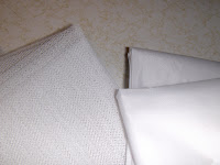
After looking around on the knot DIY board and viewing other knottie profiles I came across a knottie that decided to dye her slip (or crinoline). I loved the idea of having a little bit of color under the dress so I did some investigating on line and decided to try out some dyes on test fabric before perminatly altering the color of a $50 slip. I wanted to make sure that I got the same type of fabric as my slip so I toted the sucker into JoAnne Fabrics to find a fabric that was 100% nylon and had the same weave, texture and whatever as the slip. Luckily, I was able to find just that and for $3.49/yard for the crinoline fabric and $1.49/yard for the netting and bought two yards of each for testing.
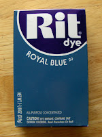
Through investigating I found two products that were offered at my local stores: Rit Dye and Dylon.
Rit Dye was one that I had heard of but the stores here only offered it in Royal Blue. Through their website, www.ritdye.com, I fould that this acid based dye reacts well to 100% nylon products so I felt confident that it would work with my slip but at the same time I still wanted to do a test run. For this product it called for HOT water and a whole cup of salt.
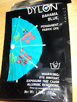
I had never heard of Dylon before but I decided to give this one a go because it was in a lighter color that I liked. Their website www.dylon.co.uk under the help section says that "Polyester, Nylon and other synthetics cannot be dyed" but as I found out Dylon works just fine with nylon. I think they intended to say acrylic fabrics won't work. For this product it only called for warm water, which I thought was pecular, and 4T of salt.
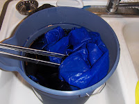
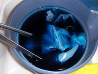
So with that, I test dyed my fabric in the sink with an already blue bucket because I was worried about staining my sink.
Rit Dye.......................................Dylon
Result:
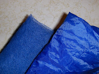
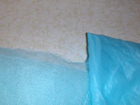
After doing this I found that not only did the Dylon work but I liked the color better than the Rit Dye. My only problem with the Dylon was that it appeared a little light and somewhat green to me even though the picture doesn't do it justice. I did show my fiancee the dyed fabrics and he agreed and suggested adding a little bit of the Rit Dye color to the Dylon to darken it up but I'm not sure if the two will play nice chemically. Maybe if I use HOT water and more salt it will absorb more of the dye.
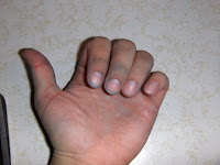
Unfortunately for me I started the Dylon first but the rubber gloves that I was wearing sprung a leak while I was mixing with my hands. After that I switched to metal bbq tongs and used the gloves only to rinse and squeeze the fabric. Even though I caught the leak early my hand was still slightly dyed blue after much scrubbing but it did fade out eventually after a few days.
Through investigating I found two products that were offered at my local stores: Rit Dye and Dylon.
Rit Dye was one that I had heard of but the stores here only offered it in Royal Blue. Through their website, www.ritdye.com, I fould that this acid based dye reacts well to 100% nylon products so I felt confident that it would work with my slip but at the same time I still wanted to do a test run. For this product it called for HOT water and a whole cup of salt.
I had never heard of Dylon before but I decided to give this one a go because it was in a lighter color that I liked. Their website www.dylon.co.uk under the help section says that "Polyester, Nylon and other synthetics cannot be dyed" but as I found out Dylon works just fine with nylon. I think they intended to say acrylic fabrics won't work. For this product it only called for warm water, which I thought was pecular, and 4T of salt.
So with that, I test dyed my fabric in the sink with an already blue bucket because I was worried about staining my sink.
Rit Dye.......................................Dylon
Result:
After doing this I found that not only did the Dylon work but I liked the color better than the Rit Dye. My only problem with the Dylon was that it appeared a little light and somewhat green to me even though the picture doesn't do it justice. I did show my fiancee the dyed fabrics and he agreed and suggested adding a little bit of the Rit Dye color to the Dylon to darken it up but I'm not sure if the two will play nice chemically. Maybe if I use HOT water and more salt it will absorb more of the dye.
Unfortunately for me I started the Dylon first but the rubber gloves that I was wearing sprung a leak while I was mixing with my hands. After that I switched to metal bbq tongs and used the gloves only to rinse and squeeze the fabric. Even though I caught the leak early my hand was still slightly dyed blue after much scrubbing but it did fade out eventually after a few days.
Subscribe to:
Posts (Atom)